


BRICK-ANEW
WHICH PAINT KIT COLOR SHOULD I CHOOSE?
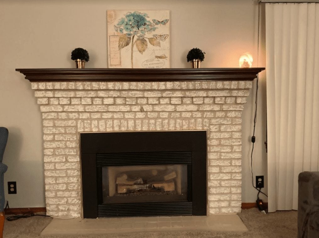
everything you need to choose the right Brick Anew paint color for your fireplace
HOW TO CHOOSE YOUR PAINT KIT COLOR
The Brick Anew paint kit comes in three different color schemes. Many of our customers are nervous about picking one over the other.
In one picture the Twilight Taupe looks warm; in another it is bright and cool. In some pictures the Misty Harbor looks just right; in others it is far too grey. In one picture, the Frosted Sunshine looks perfect, in another it is just horrendous.
This can be a tricky decision, but in this guide, we'll cover how the paint kit works and why there can be differences in fireplaces painted with the same kit. I'll give you overviews of each color scheme and show lots of customer-submitted photos to give you an idea of which color schemes pair best with which other colors.
Sit in front of your fireplace if you can; pull up pictures of your new flooring, paint, or furniture if you're renovating. Try and relax! This should be fun.
Remember, if you hate the color the first time, you can paint over it and try again or try a whole new color scheme. This isn't irreversible so enjoy the process.

STEP ONE: UNDERSTAND THE COLOR SCHEMES

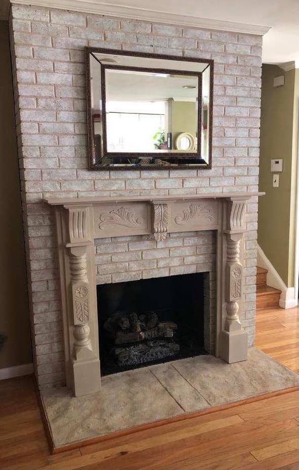
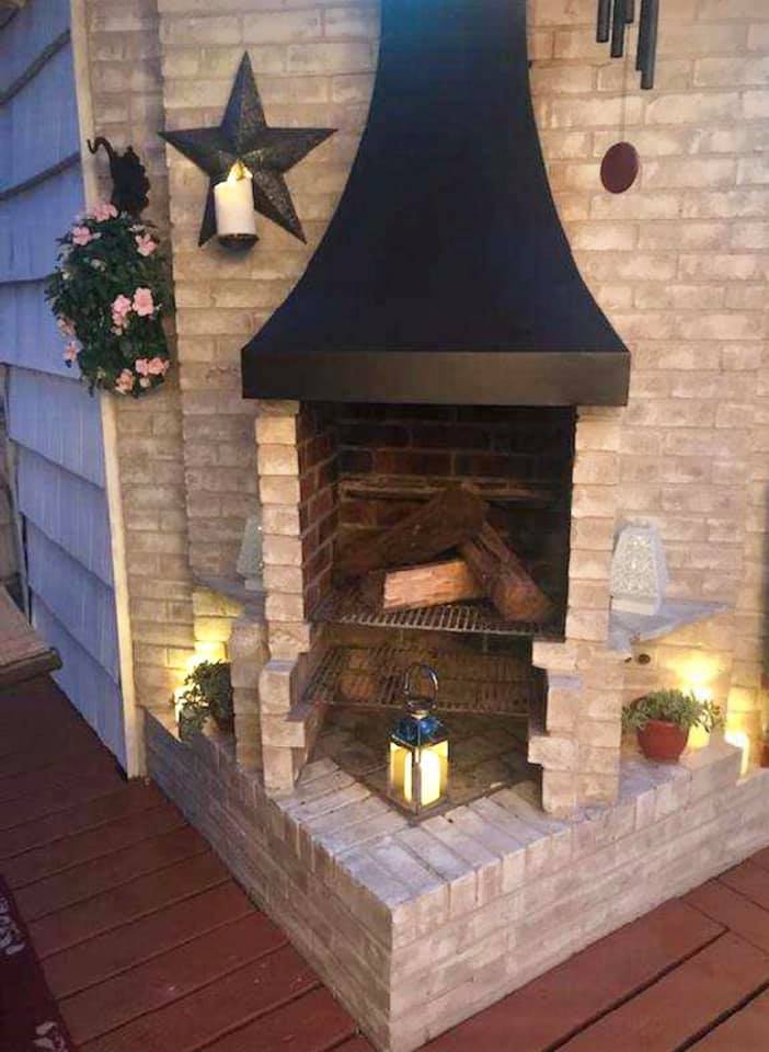
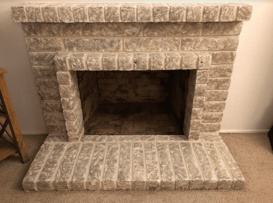
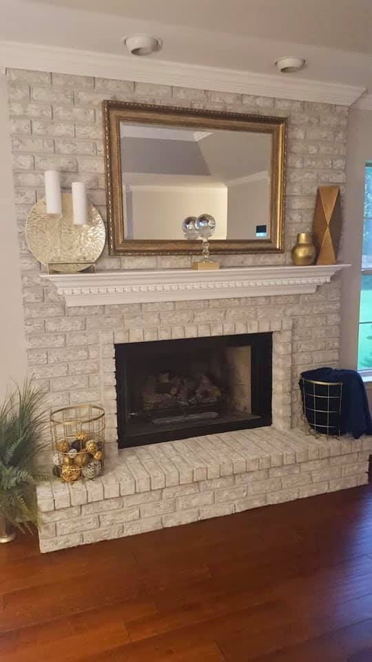
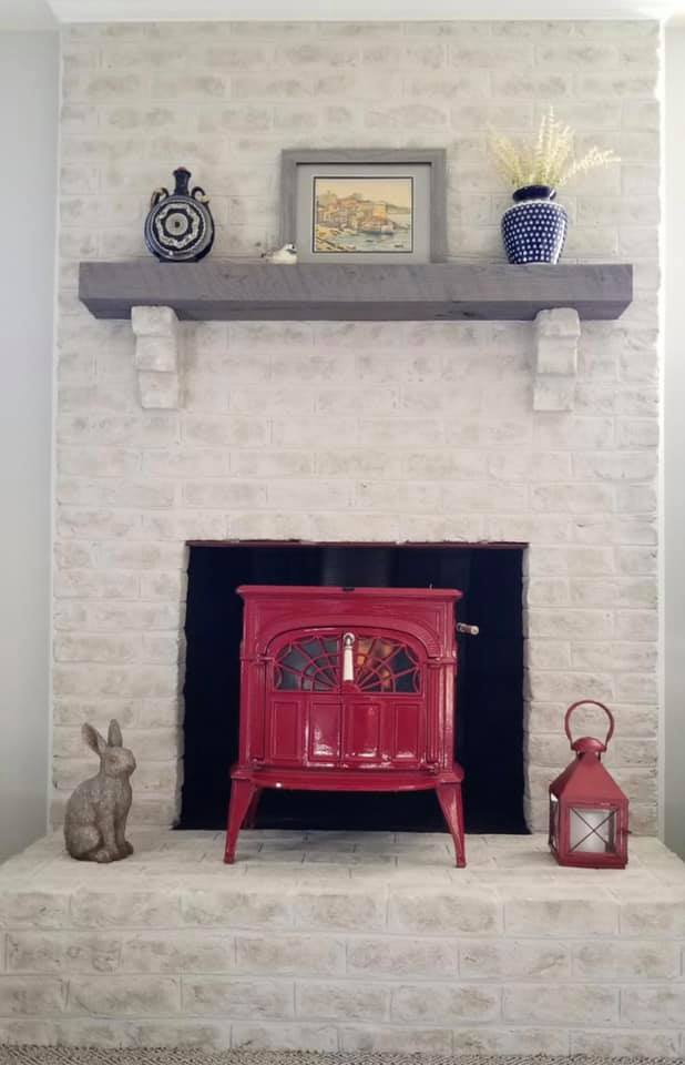
TWILIGHT TAUPE
Twilight Taupe has a base coat of light taupe with secondary colors in tan, beige, and cream. Overall, it is warm and earthy but light enough to brighten a space.
Later we will look at a whole collage of customer-submitted Twilight Taupe photos. You'll see a lot of variation. Why? The Brick Anew Paint Kit gives you lots of room for artistic liberty.
Some customer choose to use more cream and beige to cool down the tan. Other customers let more of the taupe base coat peak through the secondary colors. It's important to look at these fireplaces to get an overall feel of the color; you choose the specific look.
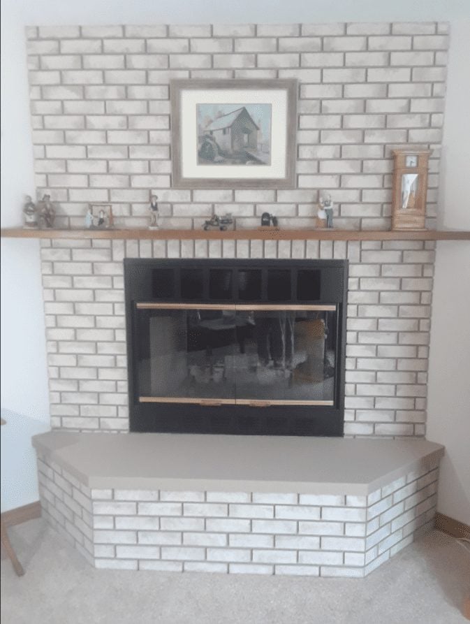
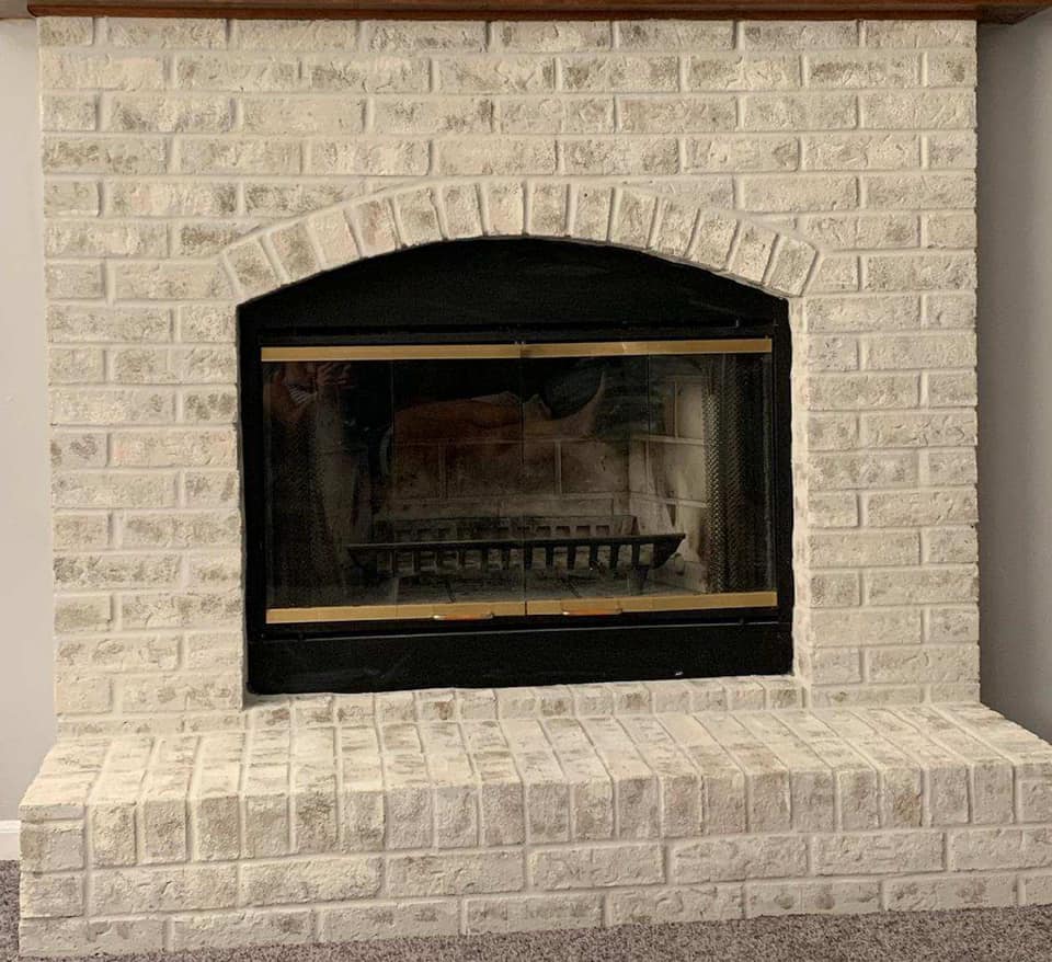
MISTY HARBOR
Misty Harbor has a light cool-grey base coat and secondary colors in tan, grey-beige, and ivory. Overall, you get a cool grey look, but the beige and tan colors allow this color scheme to pair well with rich browns.
A little later, we will look at a collage of customer-submitted Misty Harbor photos. You'll see a good bit of variation. Why? The Brick Anew process allows you to produce a unique look perfect for your space.
You may want to use more of the warmer tones to pair with your flooring. You might choose to use lots of the ivory to really give your space a bright look. Remember, just get an overall feel of the color from the photos. In the end, you will decide the finished look.


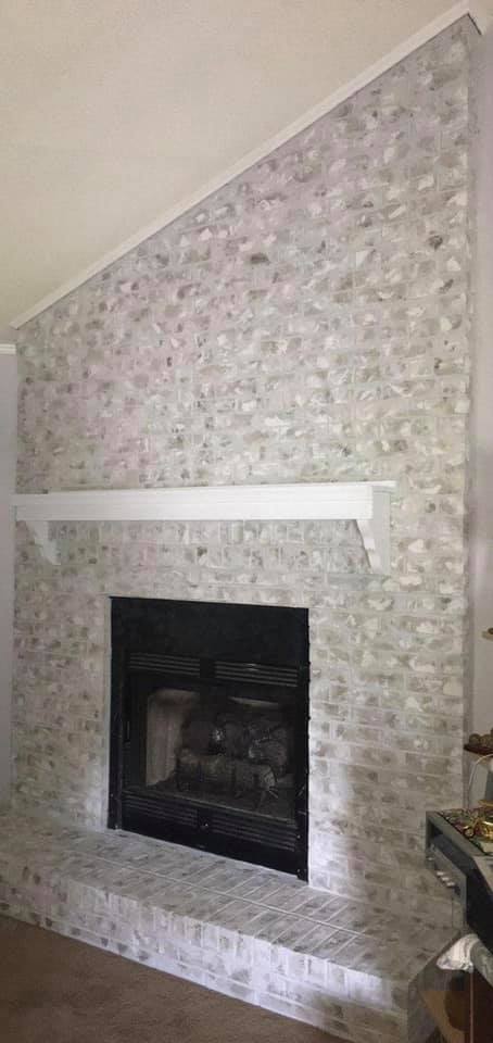
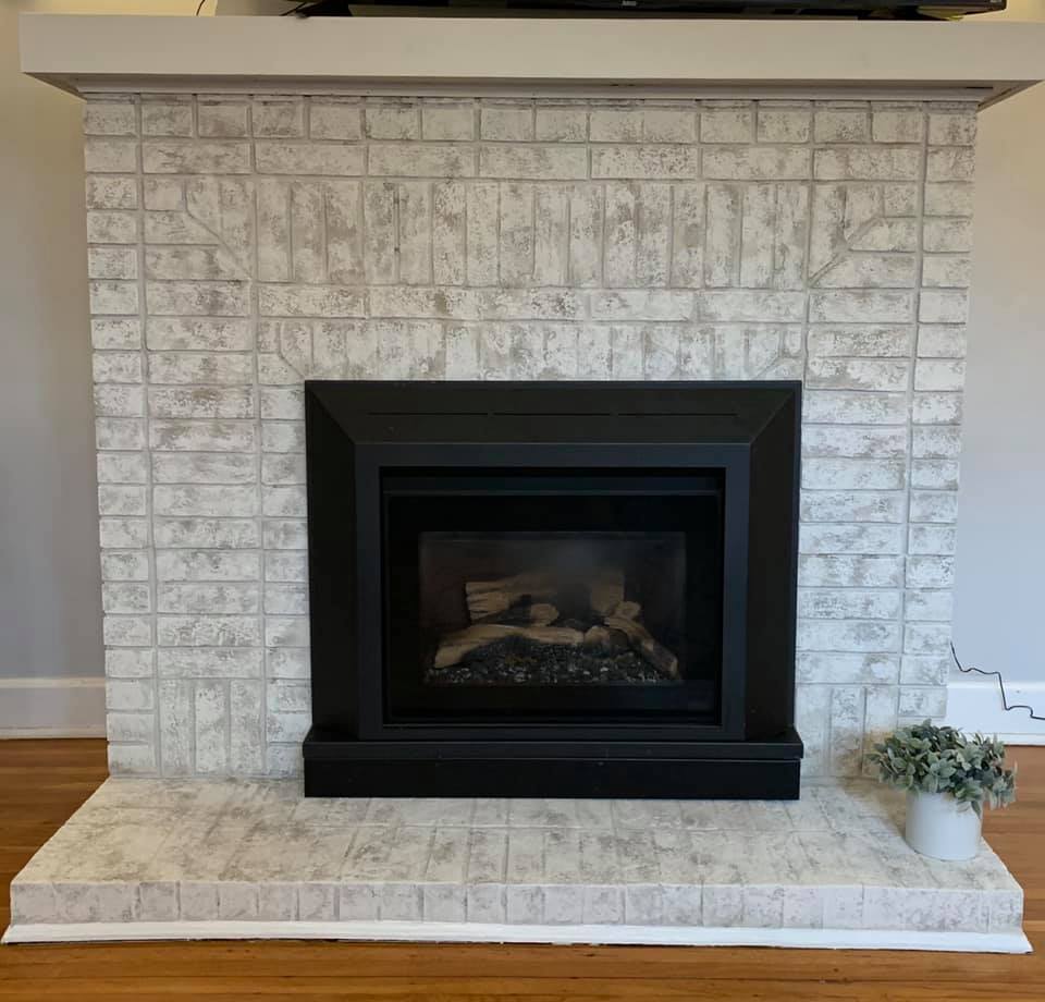
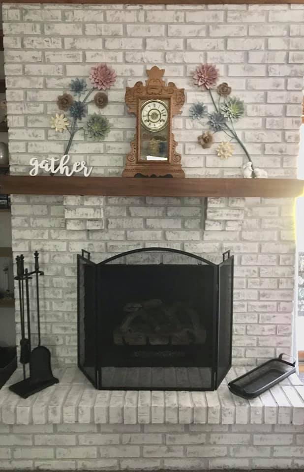
FROSTED SUNSHINE
Frosted Sunshine has a base coat of a cool tan with secondary colors in light grey, light tan, and a sunny cream. Overall, you get a lightly warm grey look with smooth yellow undertones.
A little later, we will look at a collage of customer-submitted Frosted Sunshine photos. There will be a good bit of variation because the Brick Anew process gives room for you to produce a unique look within the boundaries of the color scheme.
For example, if the base coat color doesn't work well with your space, you can mostly cover it up with the secondary tones. If you want to bring out more grey, use more of the grey secondary color.
The Brick Anew process is designed to be easy enough to follow step-by-step instructions AND flexible enough that you can create a look perfect for your space. The photos will give you an overall feel, but you choose the specific look.
STEP TWO: GET A FEEL FOR EACH COLOR SCHEME
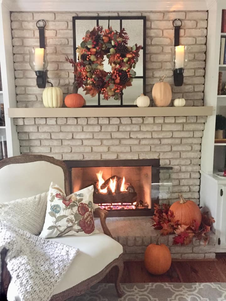
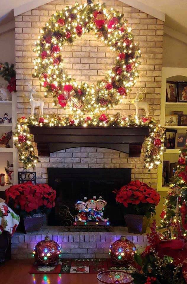
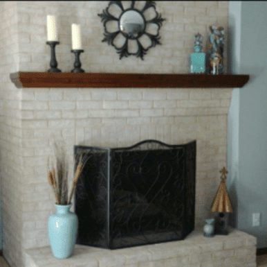
TWILIGHT TAUPE - CUSTOMER SUBMITTED PHOTOS

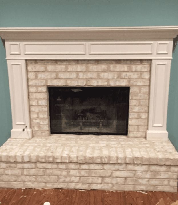
MISTY HARBOR - CUSTOMER SUBMITTED PHOTOS
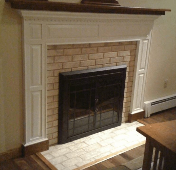
FROSTED SUNSHINE - CUSTOMER SUBMITTED PHOTOS
STEP THREE: WHICH COLORS PAIR WELL WITH WHICH PAINT KITS?
TWILIGHT TAUPE
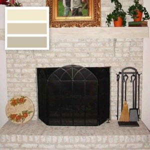
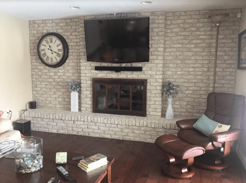
Twilight Taupe pairs well with earthy tones, grey-browns, golden browns, reds, and oranges. Let's look at the image to the right for the variety of tones it incorporates into the Twilight Taupe color scheme.
This space has golden brown flooring, white window frames, a sandy-tan sofa, plus the dark, dark brown side tables.
Twilight Taupe also works nicely with a variety of wall colors. In the collage above, wall colors include cream, yellow-tan, and cool, sandy browns.

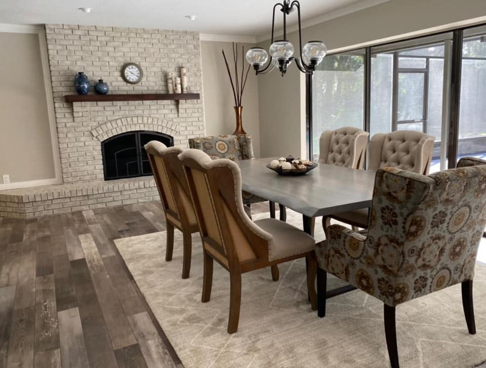
MISTY HARBOR
Misty Harbor pairs well with grey-beiges, cool greys, rich and dark browns, blues, and most cheerful colors. Let's look closer at the image to the left.
The chocolate brown floor color is my absolute favorite Misty Harbor pairing. The lightness of the Misty Harbor color scheme is well anchored by a darker tone like this.
As for wall color, you can go with a cool-off white, a grey, or even a beige-grey color. A color slightly darker than the Misty Harbor really makes the fireplace pop. If you have a beige wall color, use more of the warmer secondary colors in the Misty Harbor fireplace.
The overall grey look in the Misty Harbor makes it a perfect choice for decorating with lots of bright colors. If you prefer just one accent color, blues pair especially well with this color scheme.
The Misty Harbor paint kit also provides a modern feel that the other color schemes don't have. If you are going for today's modern feel in your space, I highly recommend the Misty Harbor kit.
FROSTED SUNSHINE
Frosted Sunshine has a very chic feel. It pairs well with sandy tones, pastels, yellows, beige-greys, and medium greys.
In the picture to the right, you can see the Frosted Sunshine paired with a creamy yellow wall, white, and medium browns in the mantel and flooring. In some of the pictures above, you see it paired with greys, deep browns, and a some pale turquoise colors.
Frosted Sunshine can give your space a chic, farmhouse look. It has variation in it's secondary colors that the other color schemes don't have, giving it an almost distressed look.

PICKING A COLOR
We've covered a lot! You understand the color schemes, the variation within each scheme, and what each scheme tends to pair well with. Now it's time to pick a color.
If you have a gut feeling, go with it. Your gut feeling about which color will work best in your space is right nearly every time.
If you don't have a gut feeling about any particular color scheme, start by narrowing it down to two. Which color will look worst in your space?
Do you have an earthy space with lots of warm browns? The Misty Harbor probably won't look quite right there. If you have a modern space with mostly cool colors, the yellows in the frosted sunshine might look out of place. If your walls or floors are a cool grey, the Twilight Taupe isn't your best option.
HELP! I'M STUCK BETWEEN TWO COLORS!
Twilight Taupe vs. Misty Harbor: If you're stuck between Twilight Taupe and Misty Harbor, you probably have some greys and browns or a prominent grey-brown color in your space.
1. What can change? What in your space can change to lean it more towards Misty Harbor or Twilight Taupe? Do you have grey walls and brown floors? Throw up beige curtains to lean more towards Twilight Taupe or lay down a grey rug to lean more towards Misty harbor.
2. What accent colors do you like to decorate with? If you prefer muted tones (especially red), lean towards Twilight Taupe. If you prefer vibrant colors (especially blue in any shade) lean towards Misty Harbor.
3. Which photo incorporates colors that you have in your space? Go back through the collages and look for colors that you have in your space. Is that wall color similar to your couch? Is that flooring shade similar to yours? How do those shades pair with the fireplace in the photo?
Misty Harbor vs. Frosted Sunshine: If you are stuck between Misty Harbor and Frosted Sunshine, you might be trying to decide between the beautiful greys in each.
1. What can change? What in your space can change to lean it more towards Misty Harbor or Frosted Sunshine? If your furniture is a rich brown and your walls are a sunny yellow, you could add some pastel throw pillows to lean more towards Frosted Sunshine or put up some cool blue wall art to lean towards Misty Harbor.
2. What accent colors do you like to decorate with? If you prefer vibrant colors or neutrals, lean towards Misty Harbor. If you prefer pastels, lean towards Frosted Sunshine.
3. Which photo incorporates colors that you have in your space? Go back through the collages and look for colors that you have in your space. Is that wall color similar to your couch? Is that flooring shade similar to yours? How do those shades pair with the fireplace in the photo?
Frosted Sunshine vs. Twilight Taupe: If you're stuck between Frosted Sunshine and Twilight Taupe, you might have a space that incorporates yellows and browns or greys and browns. You might be stuck between the creamy taupe and the chic sunshine look.
1. What can change? What in your space can change to lean it more towards Frosted Sunshine or Twilight Taupe? Do you have yellow-tone walls and a golden brown floor? You can add a light grey rug to lean more towards Frosted Sunshine or repaint your walls to lean more towards Twilight Taupe.
2. What accent colors do you like to decorate with? If you prefer dark tones (especially red), lean towards Twilight Taupe. If you prefer pastel shades, lean towards Frosted Sunshine.
3. Which photo incorporates colors that you have in your space? Go back through the collages and look for colors that you have in your space. Is that wall color similar to your couch? Is that flooring shade similar to yours? How do those shades pair with the fireplace in the photo?


