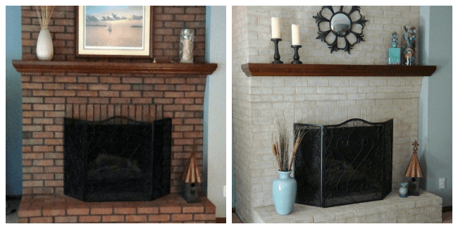
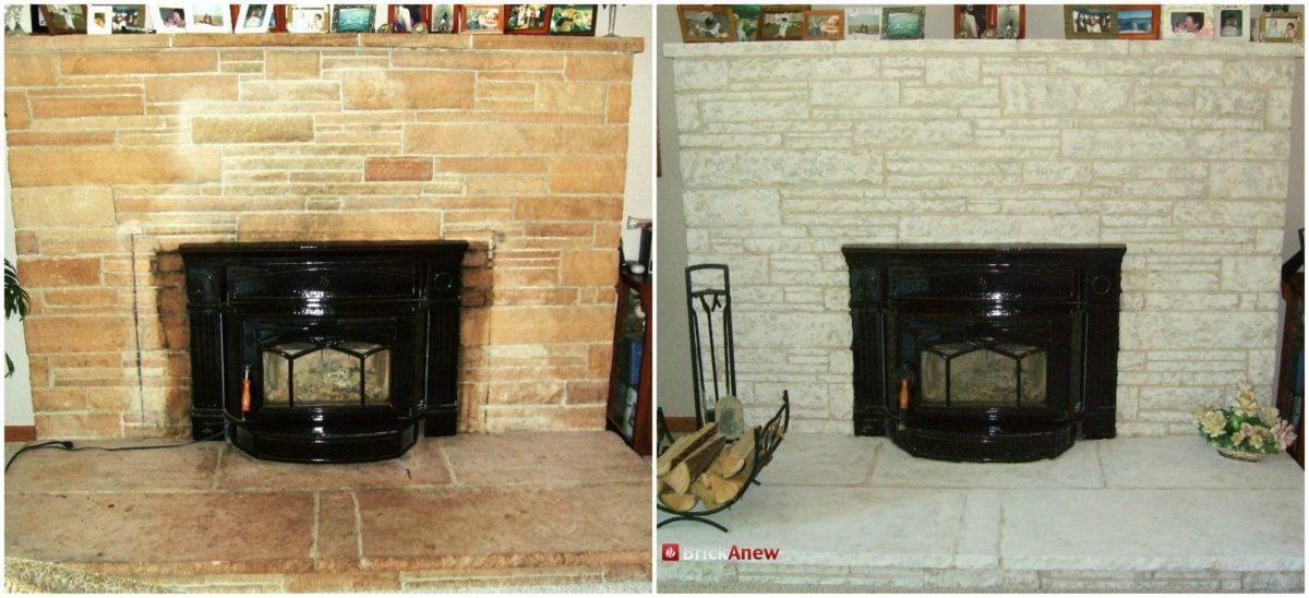
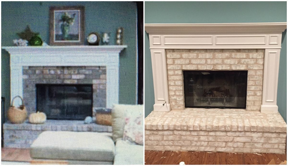
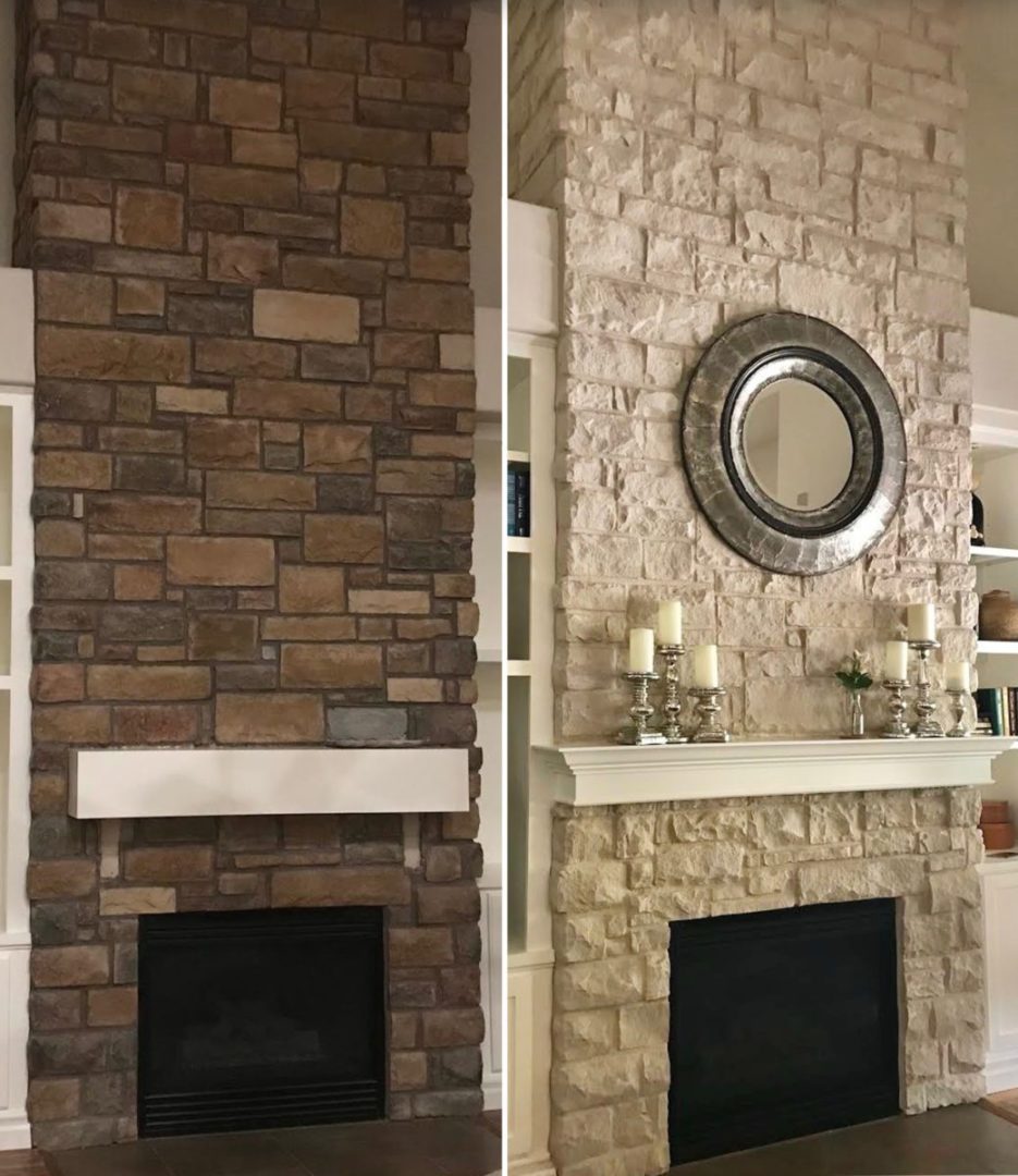
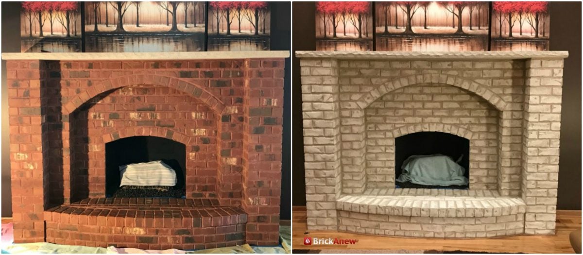
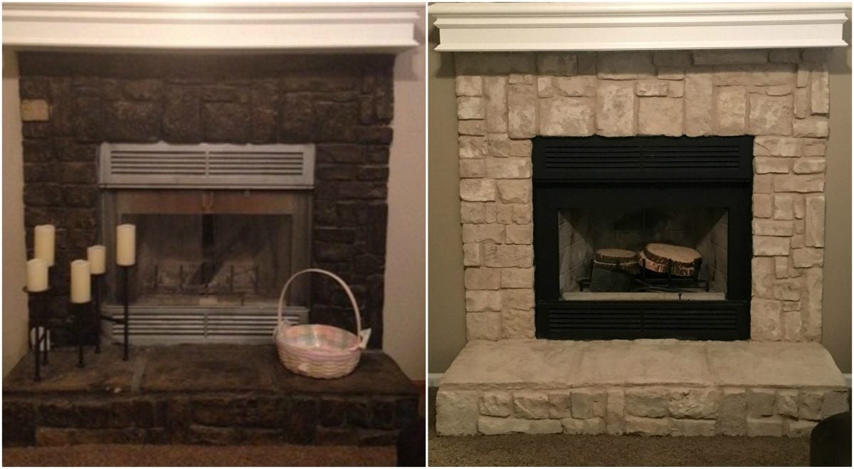
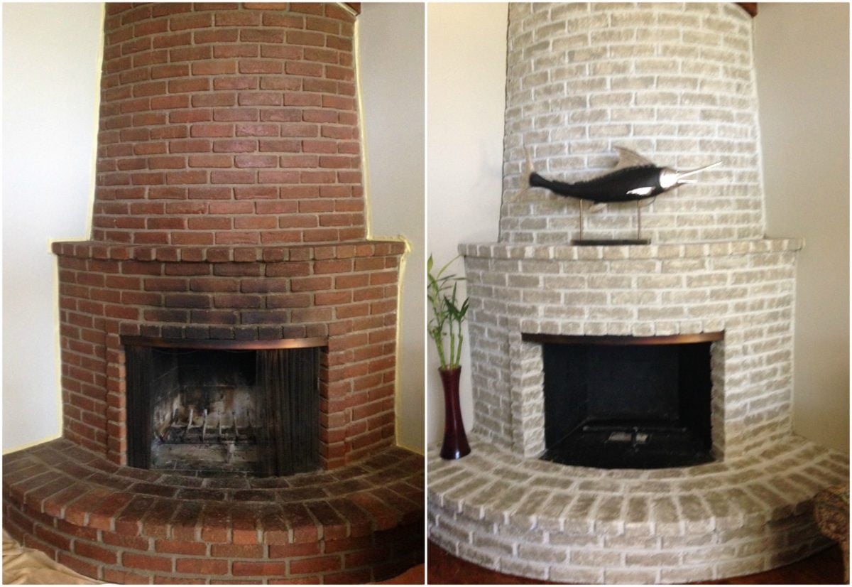
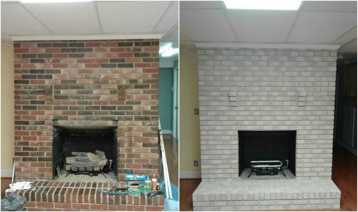
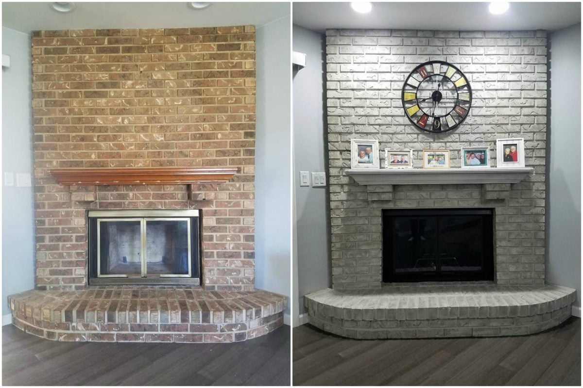
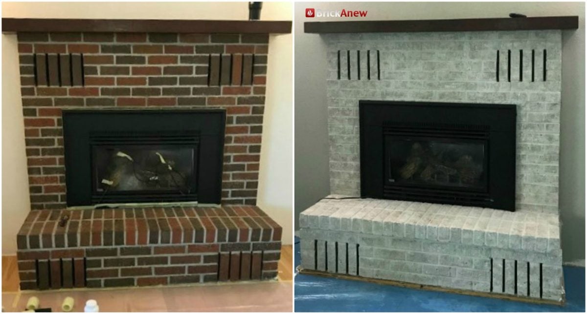
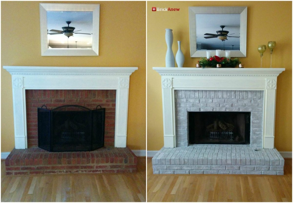
Each kit produces a different finish depending on your starting brick, surrounding light, and decor. Browse the galleries below to see how each colour reads in real living rooms.
Twilight Taupe
Works with: Grey-brown decor, neutral palettes, modern farmhouse interiors.
Warm taupe layered with soft greys and browns. Photographs richer in warm light, cooler under shaded lamps.


Misty Harbor
Works with: Cool grey walls, modern interiors, blue-toned decor.
Cool greys with subtle blue undertones — the most contemporary of the three. Pairs naturally with cool walls and sage / blue accents.
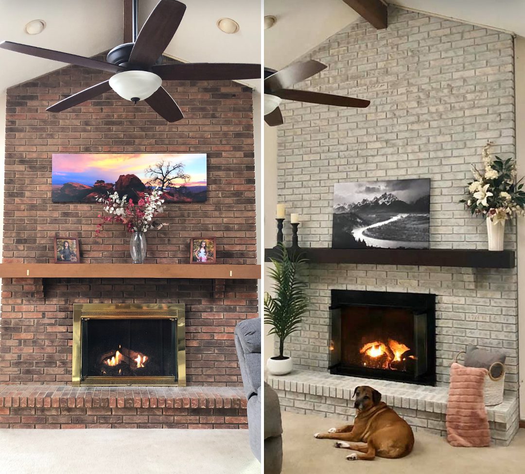
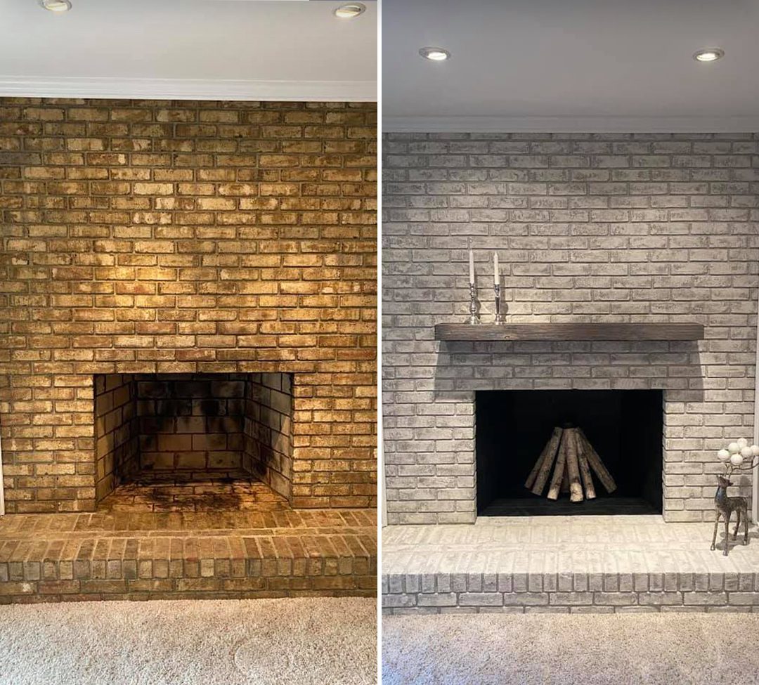
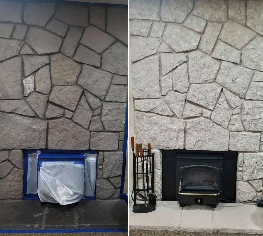
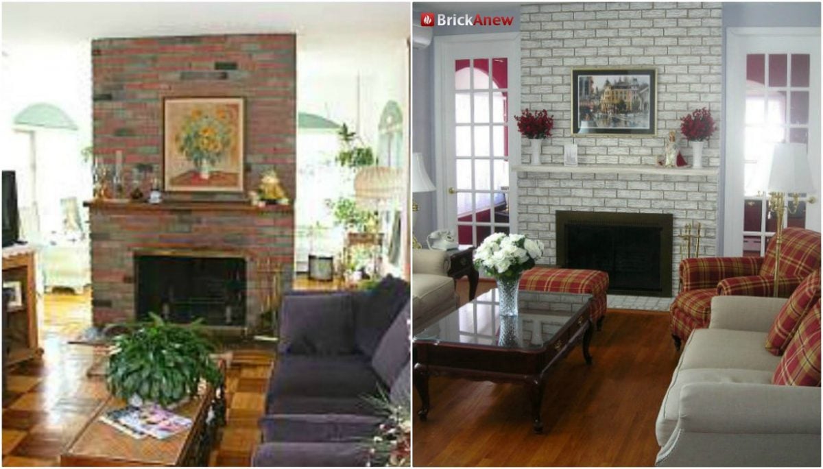
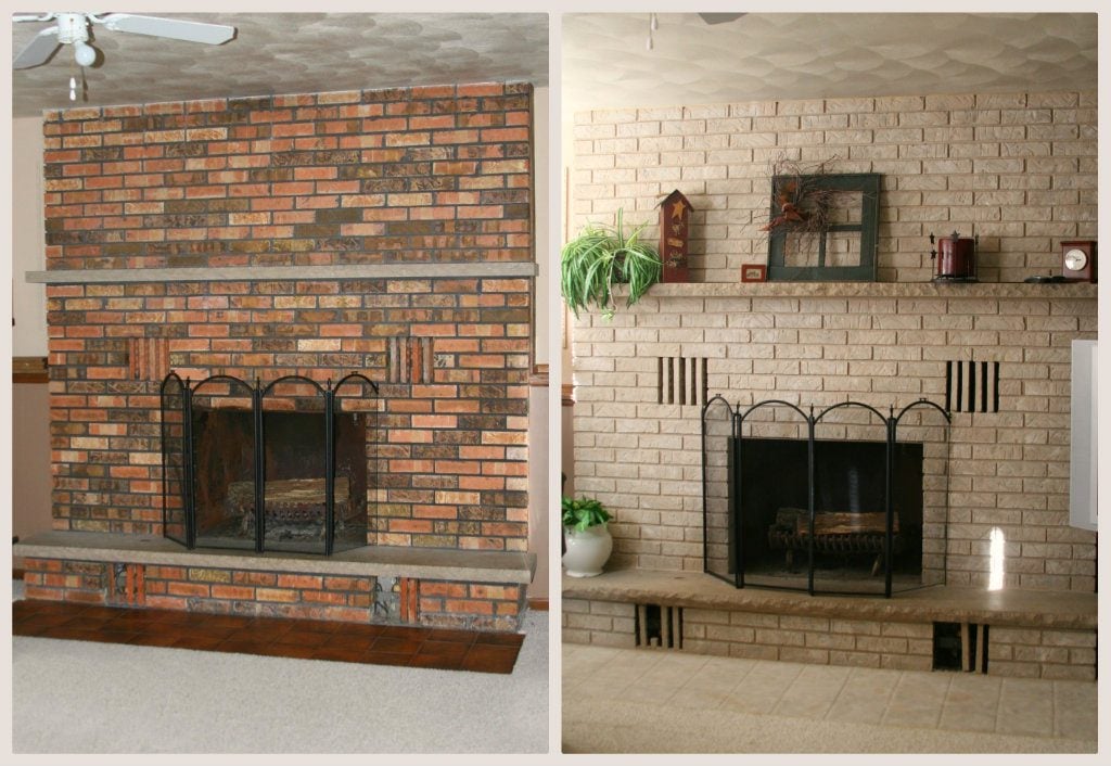
Frosted Sunshine
Works with: Cream / yellow walls, bright open-plan spaces, traditional decor.
Warm tans and creams with a hint of light yellow — bright and airy. Works well with cream or yellow-toned walls.